A clean, contemporary identity defines this retail fitout, where warm lighting, refined materials, and a strong brand presence come together to create a space that feels both inviting and efficient. The design balances visual clarity with operational flow, allowing the customer experience to remain front of mind while the functional workspace operates seamlessly behind the scenes.
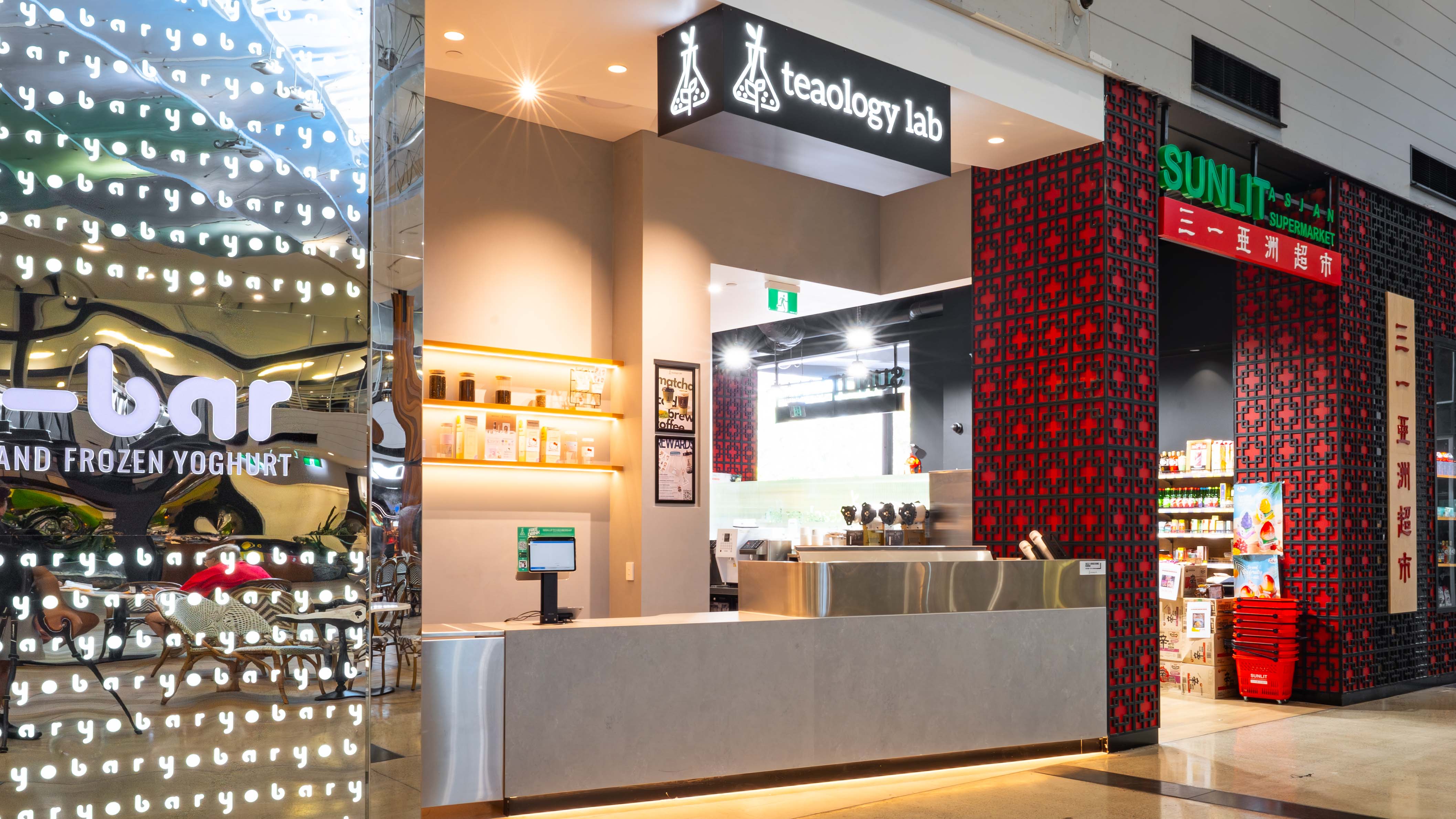

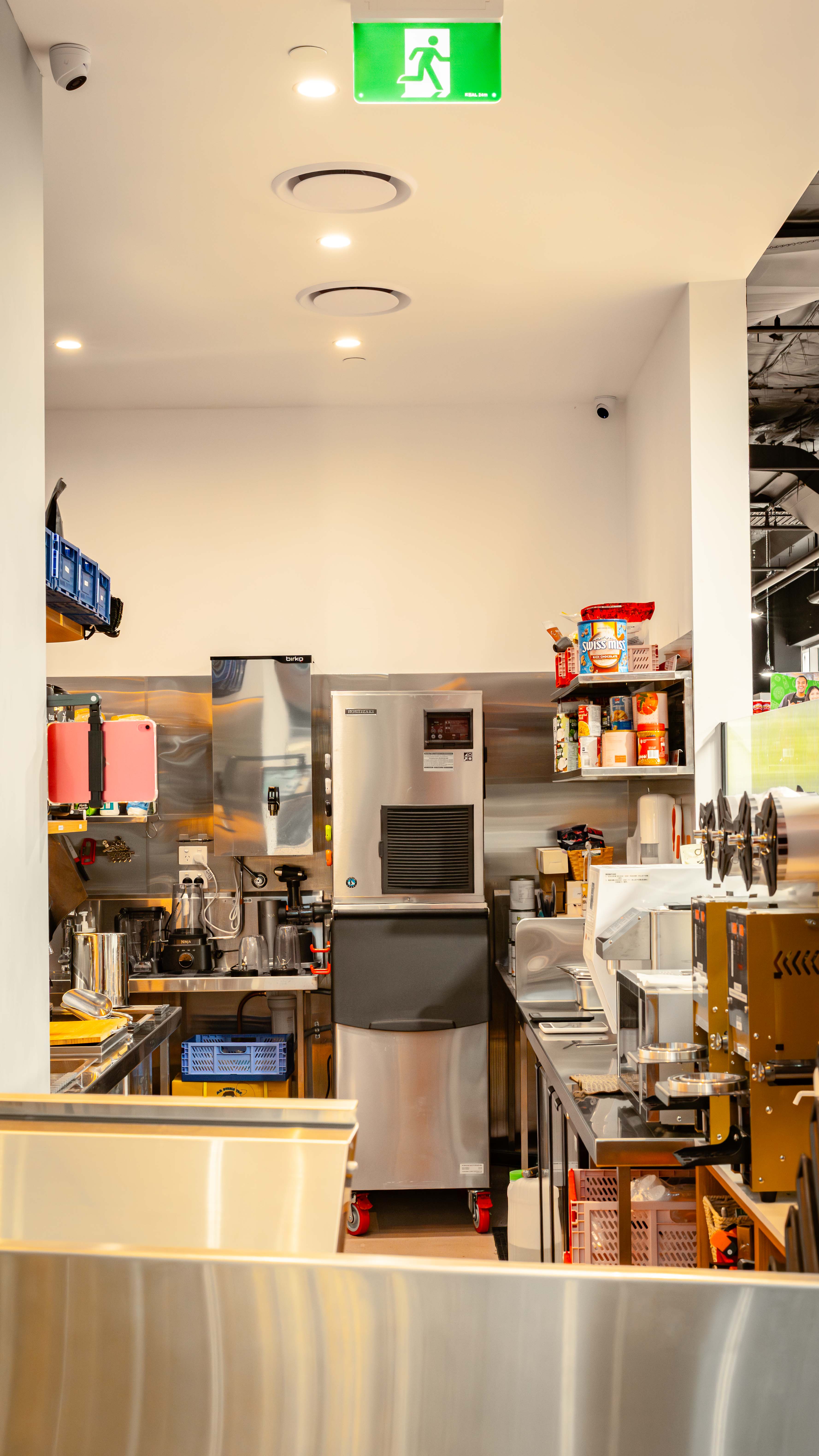
The design brings together branding, materiality, and lighting to create a cohesive and highly legible retail environment. A restrained base palette of soft neutrals and stainless steel establishes a clean, contemporary foundation, allowing the vibrant menu displays and product graphics to become focal points within the space. Warm integrated lighting is used strategically across shelving, counters, and wall features to introduce depth and highlight key touchpoints. The layout is carefully considered to separate front-of-house experience from back-of-house efficiency, ensuring a seamless workflow without compromising the clarity and openness of the customer-facing areas.


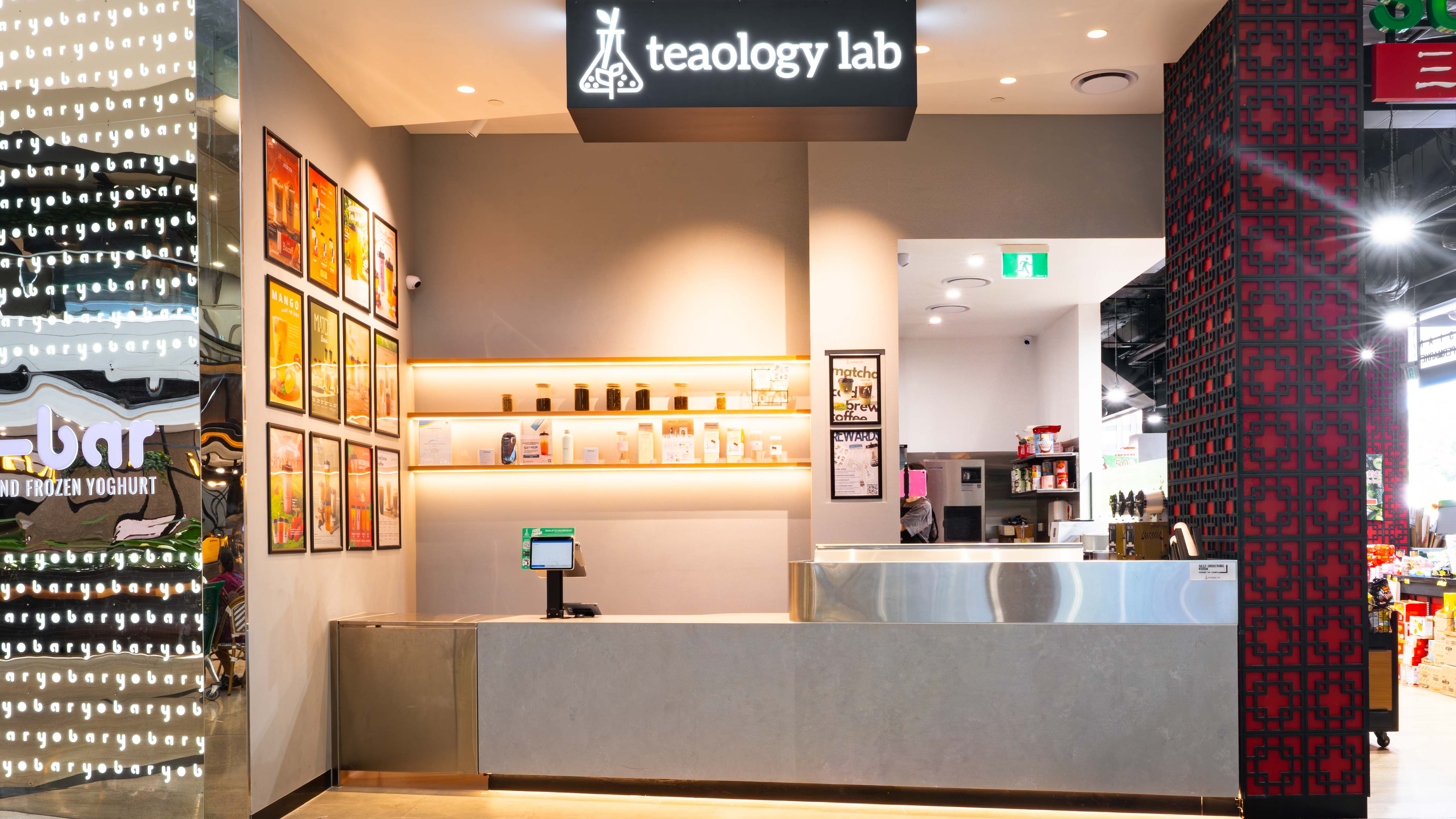
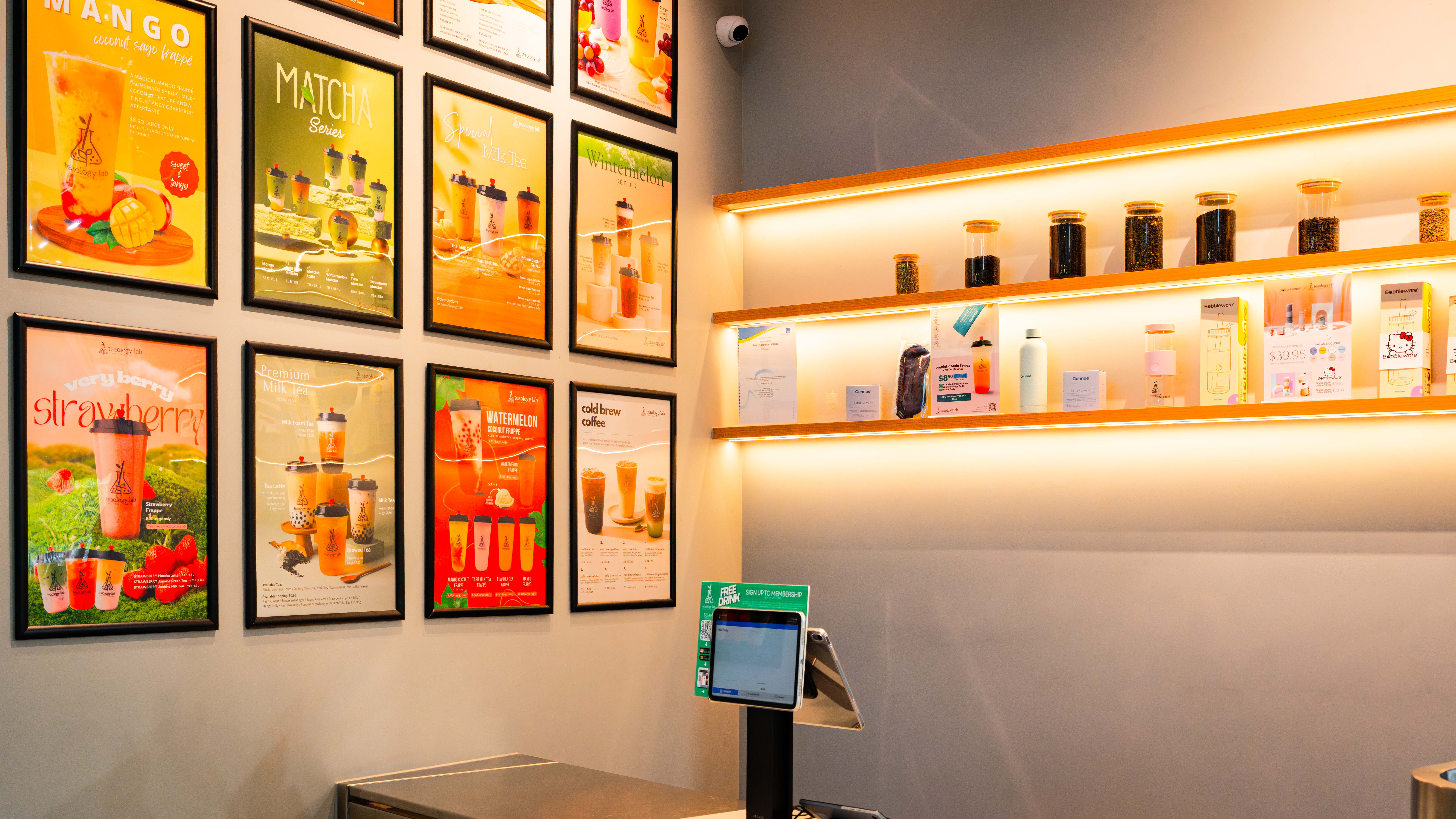
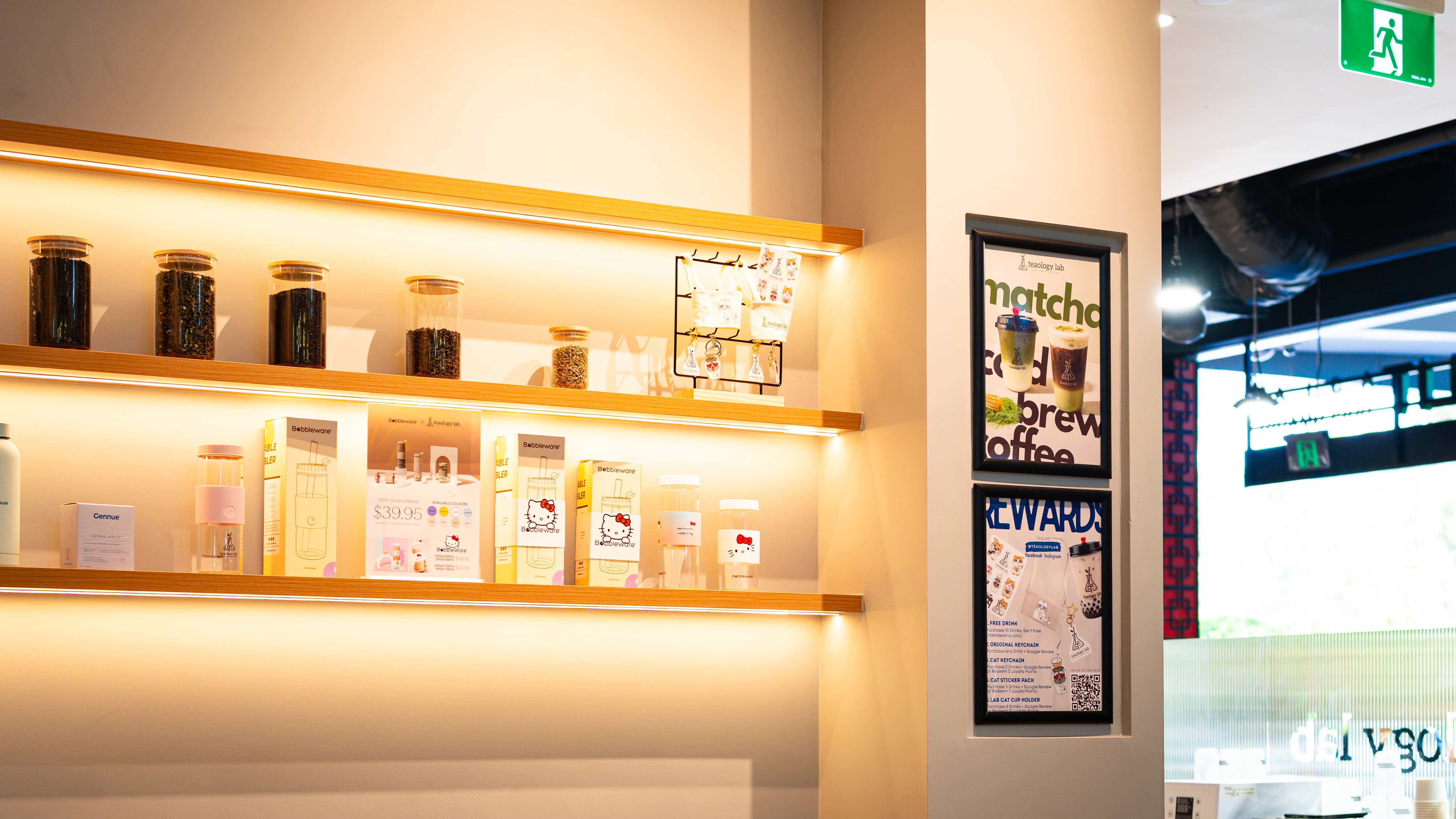
refined moment of detail is expressed through the front counter and feature display wall.
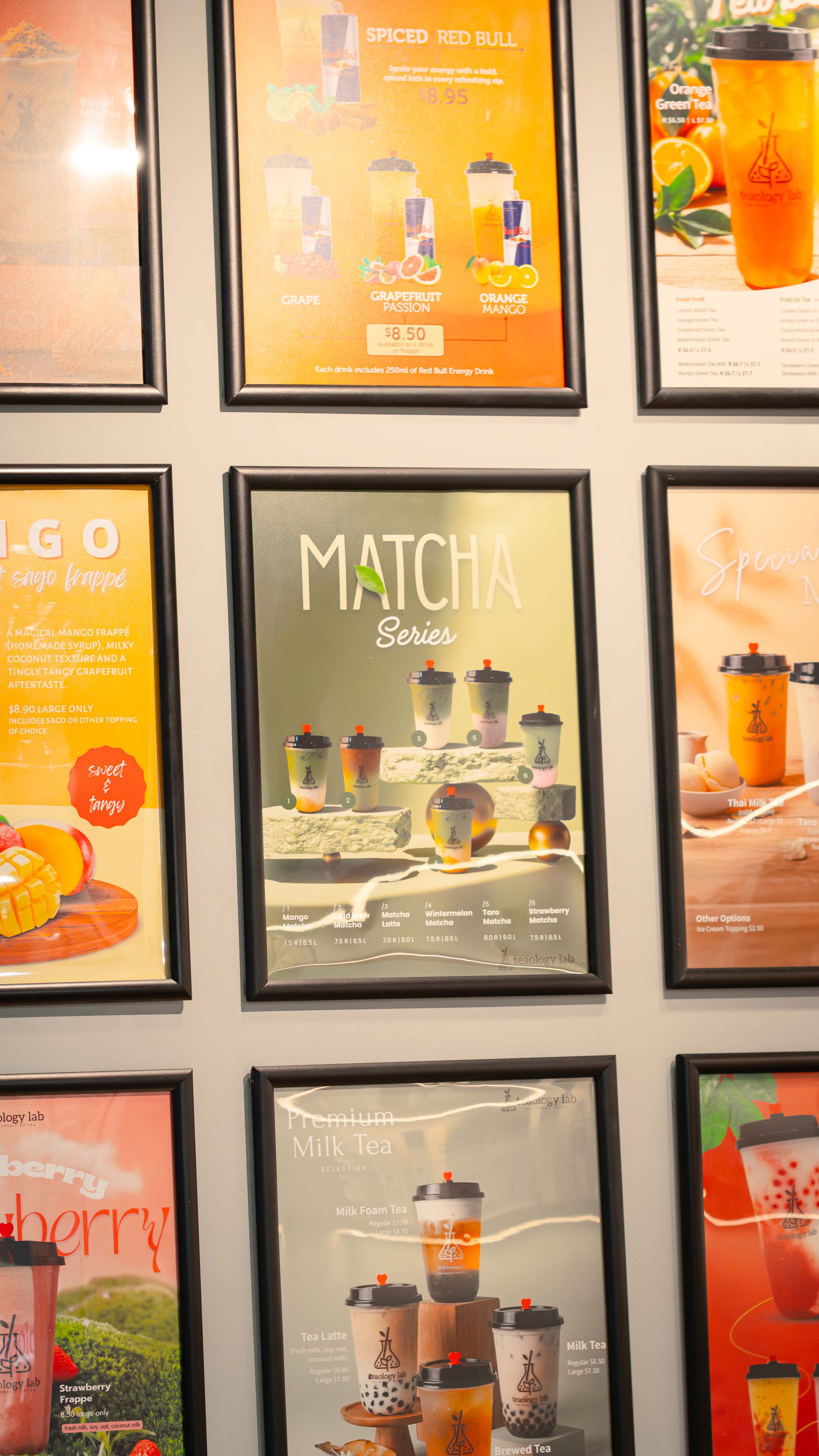
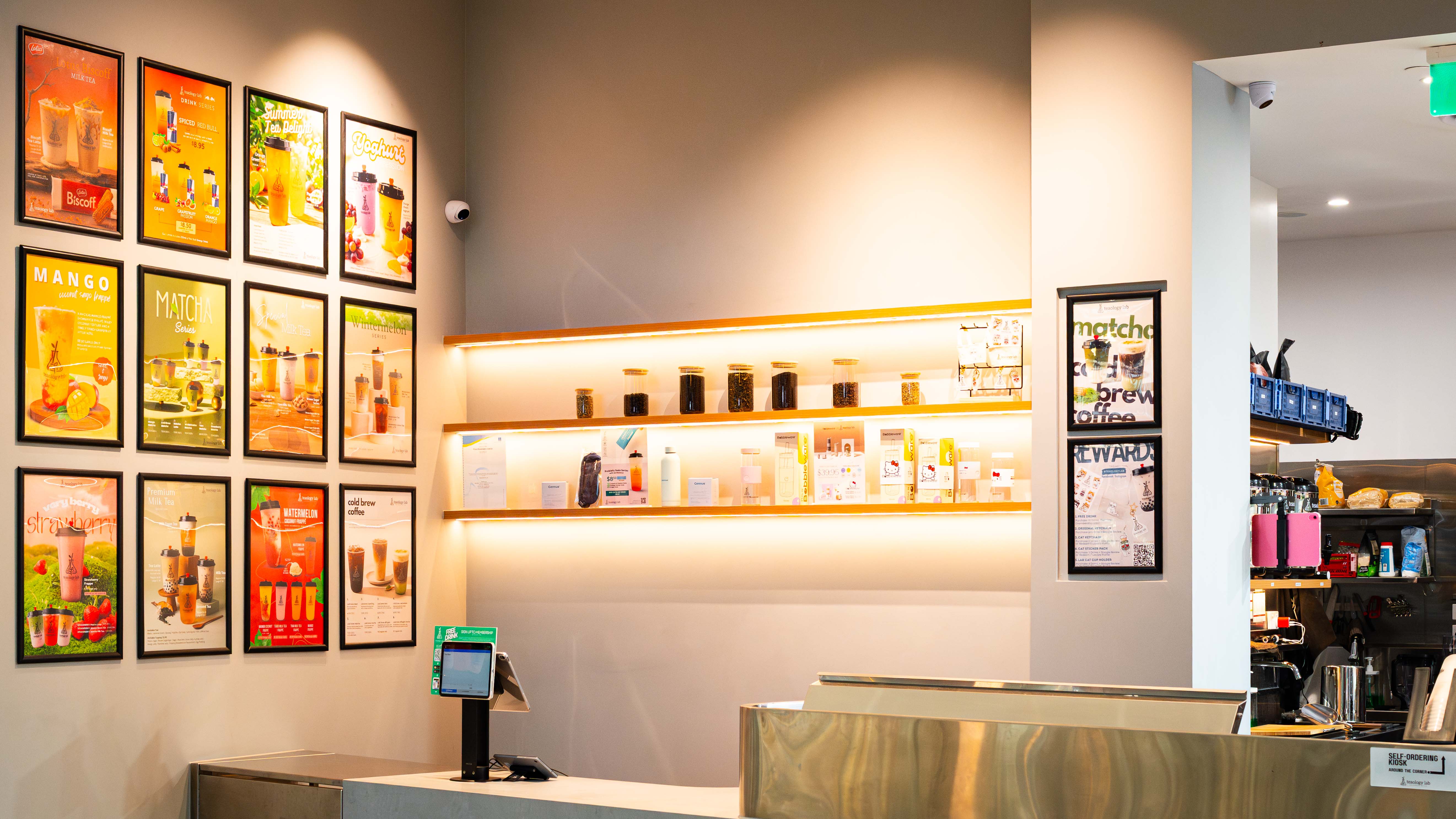
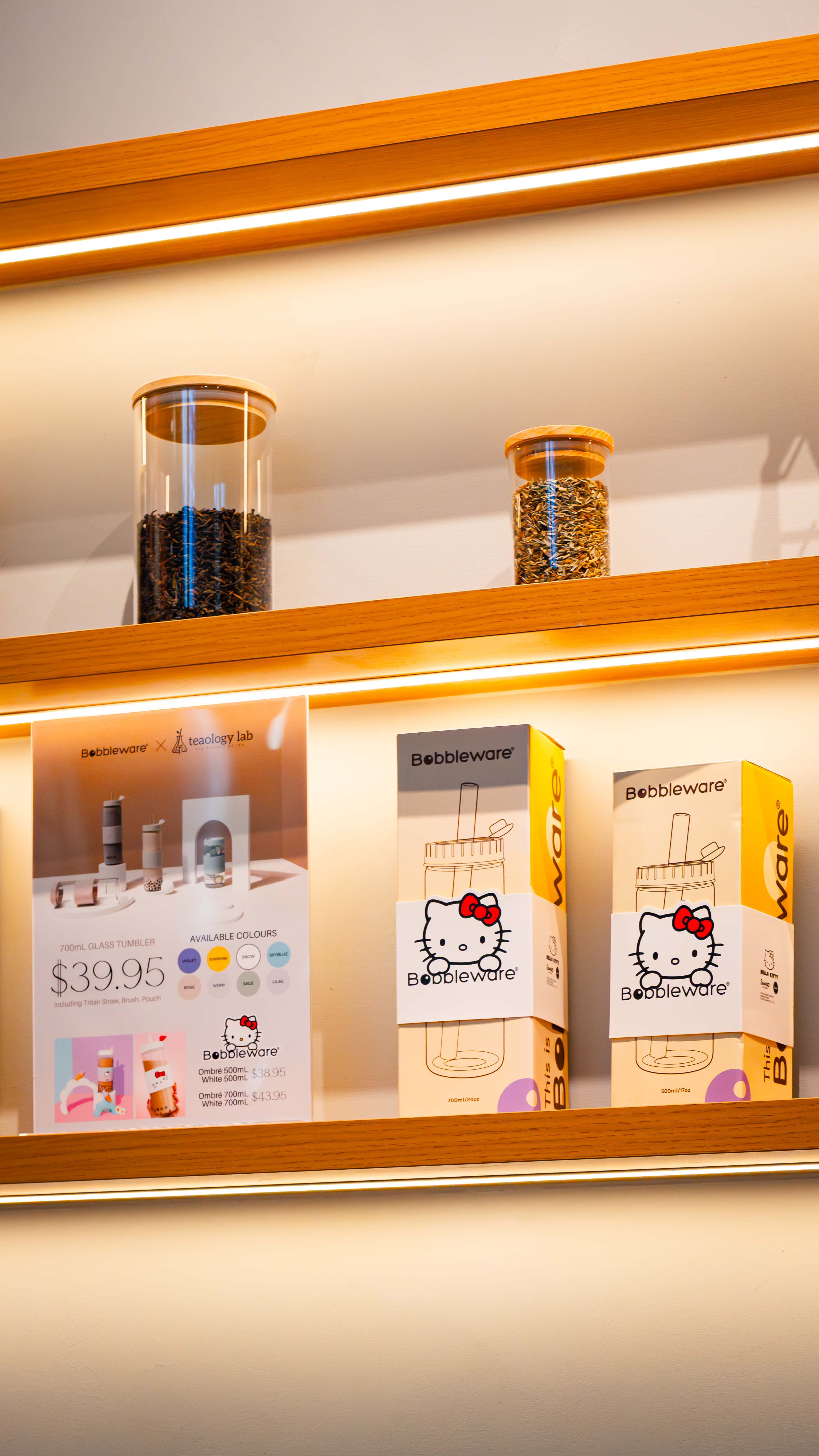
The monolithic counter, finished in a soft, seamless material, is subtly underlit to create a floating effect, elevating a functional element into a visual anchor within the space. Behind, illuminated shelving and neatly arranged product displays introduce warmth and texture, contrasting the clean backdrop. Framed menu panels are carefully aligned to establish rhythm and clarity, reinforcing the brand identity while guiding the customer experience. These elements work together to create a layered composition that is both practical and visually engaging.
This project demonstrates how a clear and disciplined design approach can elevate a compact retail environment into a cohesive and memorable customer experience. Rather than relying on overly complex gestures, the fitout is grounded in clarity, efficiency, and strong visual identity, allowing each element to contribute with purpose. The consistent use of clean lines, soft neutral finishes, and integrated lighting establishes a unified language that supports both the brand and the functionality of the space.
Equally important is the balance between customer-facing design and operational performance. The open, uncluttered frontage creates an inviting presence, while the back-of-house is carefully organised to ensure a seamless workflow during peak service. Strategic lighting and material contrasts highlight key touchpoints such as the counter, menu displays, and product shelving, guiding movement and enhancing engagement without overwhelming the space.
The interplay between warm lighting, stainless steel surfaces, and refined joinery introduces both durability and visual warmth, ensuring the space feels approachable while remaining highly practical. Ultimately, the strength of the project lies in its cohesion. Every detail, from the illuminated signage to the smallest display element, is considered as part of a larger system, resulting in a fitout that is efficient, brand-driven, and designed to perform consistently in a fast-paced retail setting.
Designer: Rogue Architects, Aman Omar
Build: Teaology lab
roguearchitects.com.au